Jessie Han is a UI/UX Designer at Logic Solutions. In today’s guest article, she writes about her experiences creating user-friendly designs that are intuitive, utilize modern best practices, and help to make clients’ applications stand out.
As a UX designer, I am often asked by product managers or the sales team to add features they believe will appeal to their users. My first step is to conduct a user research study and confirm if this feature is what the users really need or if it’s just a fancy function the managers want to add.
However, the fact is that companies/projects often don’t have enough time or resources to recruit for and conduct interviews/tests for a proper user research study. In these situations, I use comparative analysis as a data collection workaround. Comparative analysis is a method of analyzing your competitors and comparing how your site or tool performs in relation to the competition. Knowing what your competitors provide and not provide is always better than guessing on your own.
Comparative Analysis vs. Competitive Analysis
Most people have heard the term “Competitive Analysis”. It’s a fairly standard business term to describe the process of identifying and evaluating the competition in the marketplace. But in the UX field, we prefer “Comparative Analysis”.
What’s the difference? Briefly speaking, the difference between “competitive analysis” and “comparative analysis” depends on which competitors you choose. “Competitive analysis” focuses more on direct competitors who provide almost the same services; “comparative analysis”, on the other hand, focuses on both direct and indirect competitors, including competitors that only provide a small portion of features similar to you. The benefit of comparative analysis is that we can include more diverse competitors and get more comprehensive information than competitive analysis.
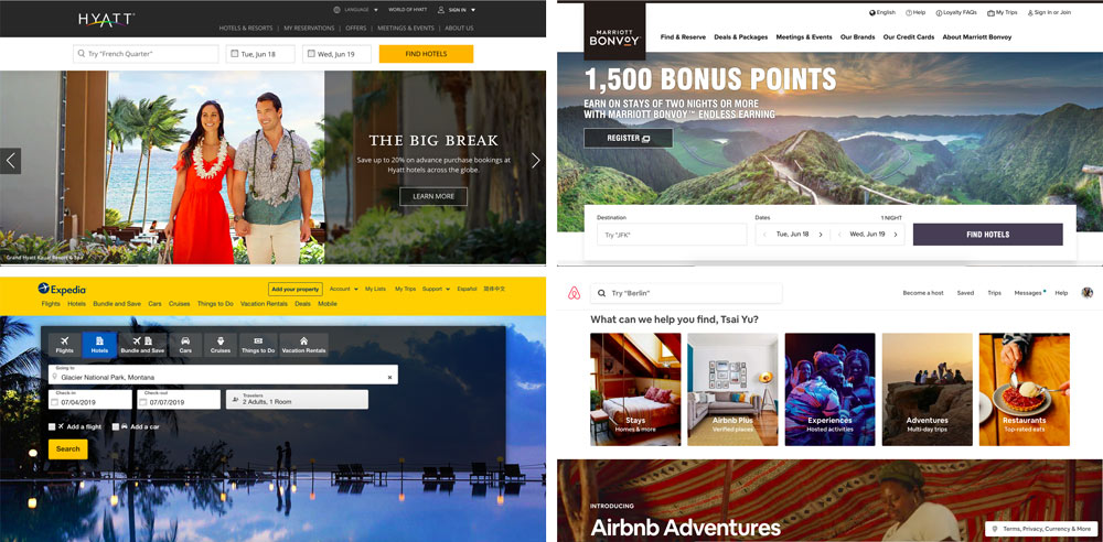
Let’s take Hyatt hotels and “hotel booking” for example. The direct competitors of Hyatt may be Marriott, Hilton, or IHG. These direct competitors provide similar services and probably have a similar booking workflow. However, in a comparative analysis, I would also check Expedia, Trip Advisor, or Airbnb. Even though Expedia, Trip Advisor, and Airbnb’s target users are different (one is a loyal customer to a brand and the other one is just looking for any hotel that’s available, or even not a hotel), these indirect competitors will offer a great number of useful insights on features such as flexible check-in/check-out dates, display of hotel information, efficient booking workflow, and after-booking services.

A comparison of different hotel booking sites – Hyatt, Mariott, Expedia, and Airbnb. Hyatt’s direct competitor is Mariott, but Expedia and Airbnb’s website experience can also offer valuable information to Hyatt on how they attract traveling tourists.
How to make the most of your comparative analysis
When conducting a comparative analysis, here are a few things to keep in mind:
Choose competitors wisely
Like mentioned above, we don’t want to just focus on direct competitors because it might not provide you with a comprehensive picture of the industry and marketplace. But how do you choose and group the competitors? First, grab any competitors that provide highly similar services and categorize them into “Tier 1”; second, grab competitors who are not direct competitors and categorize them into “Tier 2”; lastly, grab competitors that cover parts of the function and categorize them into “Niche”. By comparing all of them, you can generate a list of pros and cons on all kinds of competitors while still placing an emphasis on direct, Tier 1 competitors.
Don’t just copy and paste
When you discover a great function/layout/design on a competitor’s’ website, don’t just follow it yet. Spend a minute to think about whether it fits your website and company. Does it match your website’s style? Can it work under your site’s technology constraints? Most importantly, is there any data to support that it is a good design?
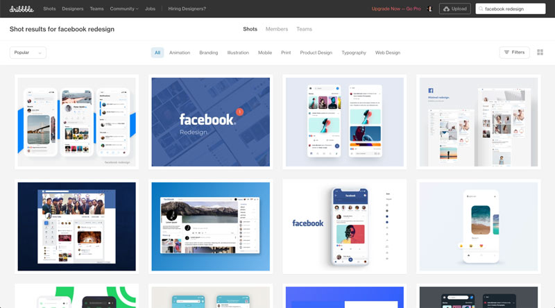
You can probably find a lot of aesthetically beautiful redesigns of Facebook’s website on Dribbble. They may look a lot better than the original UI, but they may not work at all under all kinds of limitations or rules Facebook needs to follow. Additionally, without any user data, you don’t actually know whether their redesigns meet the needs of the actual users. Wanting to copy features that your competitors have is great, but also make sure these features can meet your and your users’ own needs, requirements, and limitations.
Screenshot of various Facebook redesign examples on Dribble
It’s a living document
Design is an iterative process. A good website will and should update itself constantly to stay up-to-date with ever-changing design trends to meet users’ evolving needs and desires. You will also need to regularly update your analysis document as well to include new trends or even new competitors in your industry. When you see a new function on a competitor’s website, capture its advantages and disadvantages compared to the original function. This periodic review process will help identify if new features or competitors are something you want to follow or something you can learn from and do better.
Conduct user tests, if possible
We’ve talked about how good comparative analysis is. However, things always have two sides. Learning from competitors is good, but the user research they did is still second-hand data for you. Hence, referencing their design may not 100% satisfy your users. In addition, you are under the assumption that they have done their own user research and design based on data-driven decisions, which may not be entirely true. That’s why user data is crucial to confirm that a design works! If you want to examine whether your design works for your users, a user-based evaluation in the context of your project scope and target audience is still strongly recommended. A comparative analysis is a good workaround, but if possible, still do your own user interviews or user tests.
Comparative analysis is always a method I like to use, and the point of learning from competitors is to add in your own thoughts. In this way, you are learning and creating instead of just following. Hope you have fun doing comparative analyses!
References:
- https://www.nngroup.com/articles/competitive-usability-evaluations/
- http://danforth.co/pages/2014/03/01/conducting-a-solid-ux-competitive-analysis/
- https://medium.com/user-research/competitive-analysis-b02daf26a96e
- https://medium.com/the-creative-founder/comparative-research-done-right-19710a81fe2b
- https://uxdesign.cc/competitive-analysis-is-a-method-not-a-solution-fa86efdfa8e9
- https://www.interaction-design.org/literature/article/why-you-should-analyze-your-competition-to-design-better-solutions-and-how-to-do-it


